
Everflora
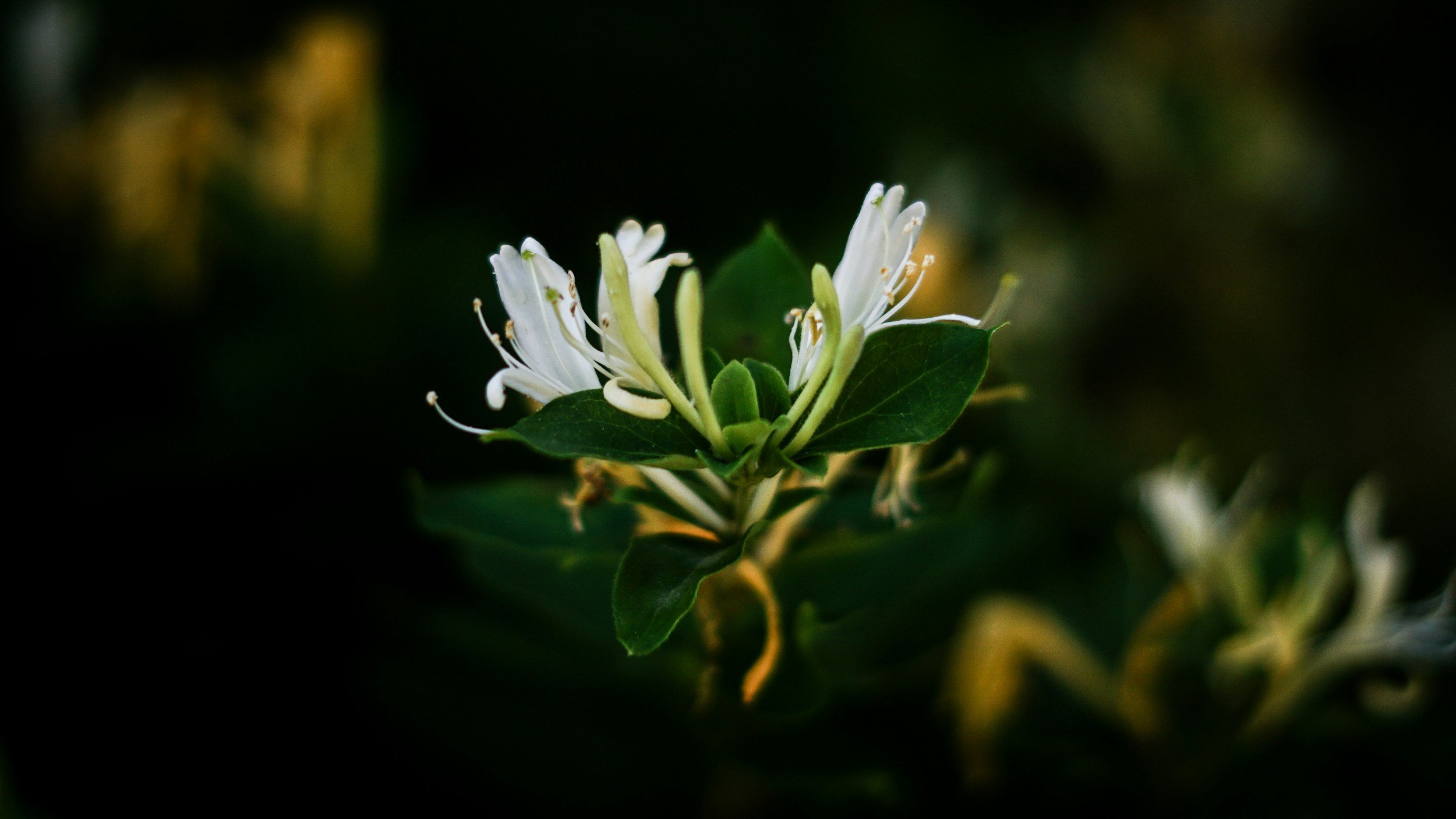
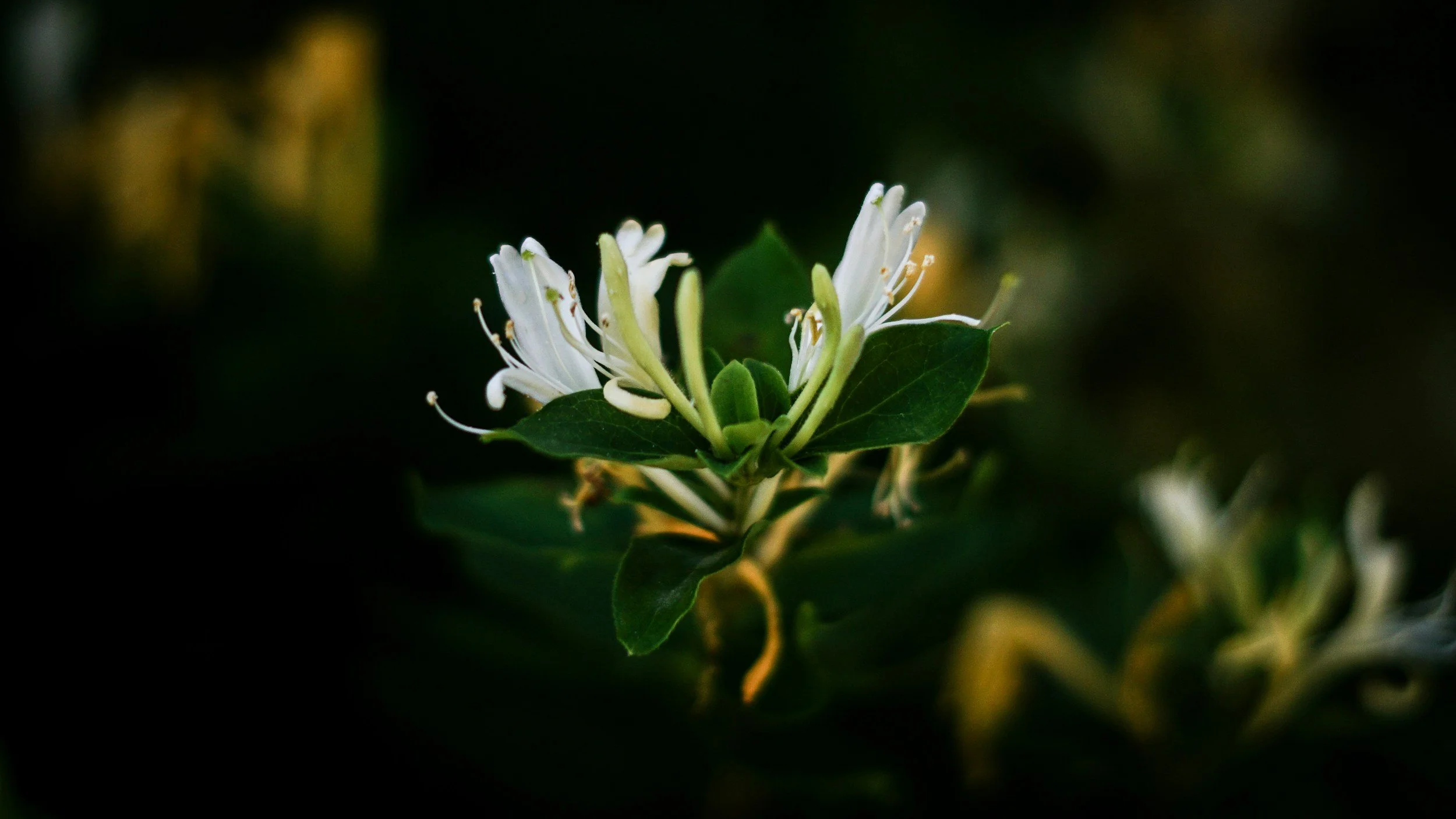
Everflora recognized that water is boring. They also recognize the abundance of underrepresented flavors rooted in a story or a cultural tradition that has yet to be told or explored. Everflora seeks to rewrite both narratives by celebrating real herbs, functional hydration, and authentic flavors powered by untold stories and traditions.
Mei wanted branding that would set her apart from the competition and giving Everflora the elevated look it needed to go places.
About:
— Logo, Typography & Color
— Brand Guidelines
— Illustration
— Packaging
Project Scope:
Client Testimonial
-
“Halle did an amazing job with our beverage package redesign and logo!! Your ability to bring our vision to life with such creativity and patience was incredible. The design perfectly captures the essence of our brand—clean, vibrant, and natural. We are appreciative of how collaborative & communicative you were throughout the whole creative process. Thank you for your professionalism and dedication to making this packaging something we’re incredibly proud of. We can't wait to share this with our customers!”
— Mei, Owner & Founder


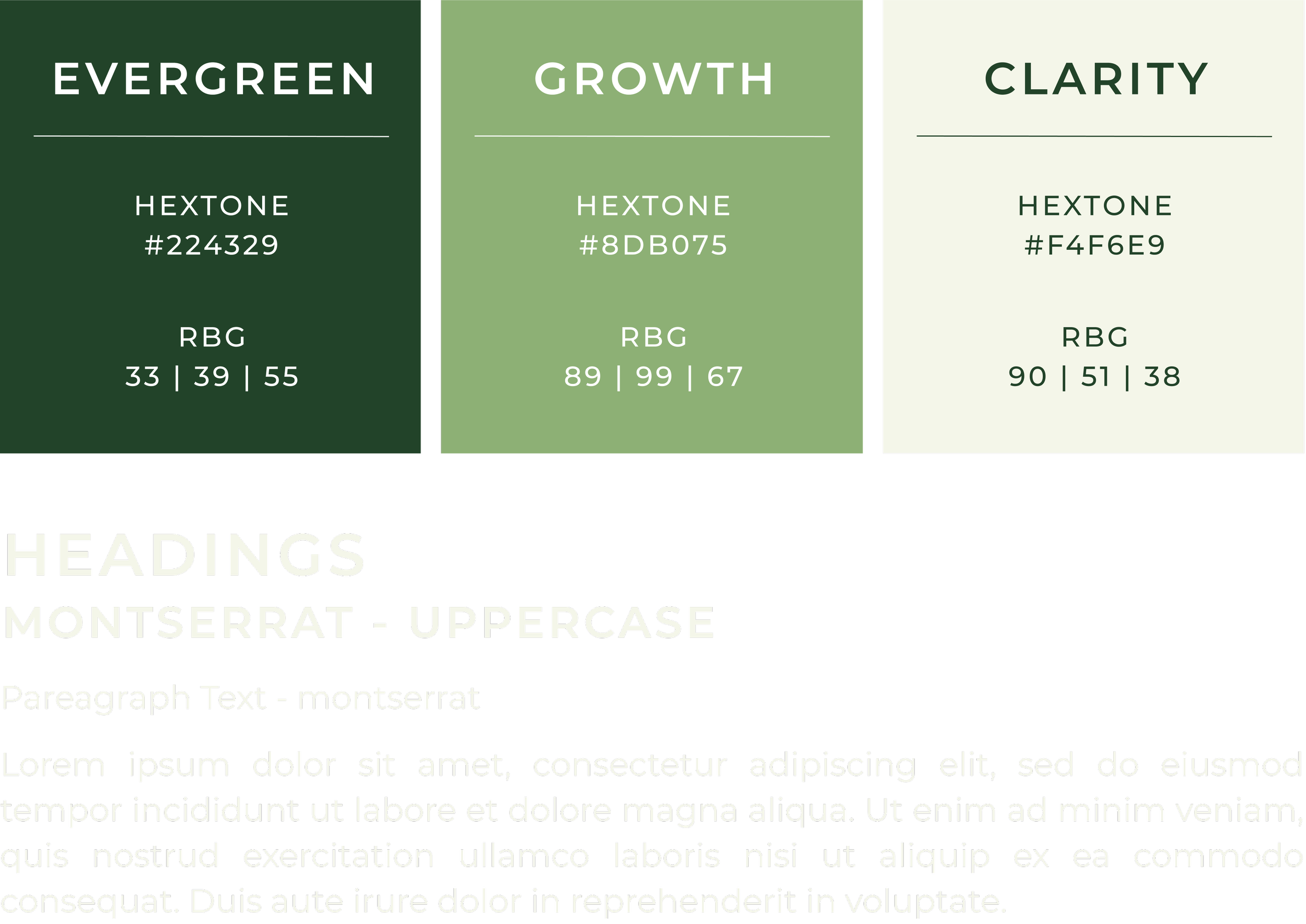
Fonts + Colors

* Continue checking out Studio 2 Skip’s Portfolio *