Wildfire training
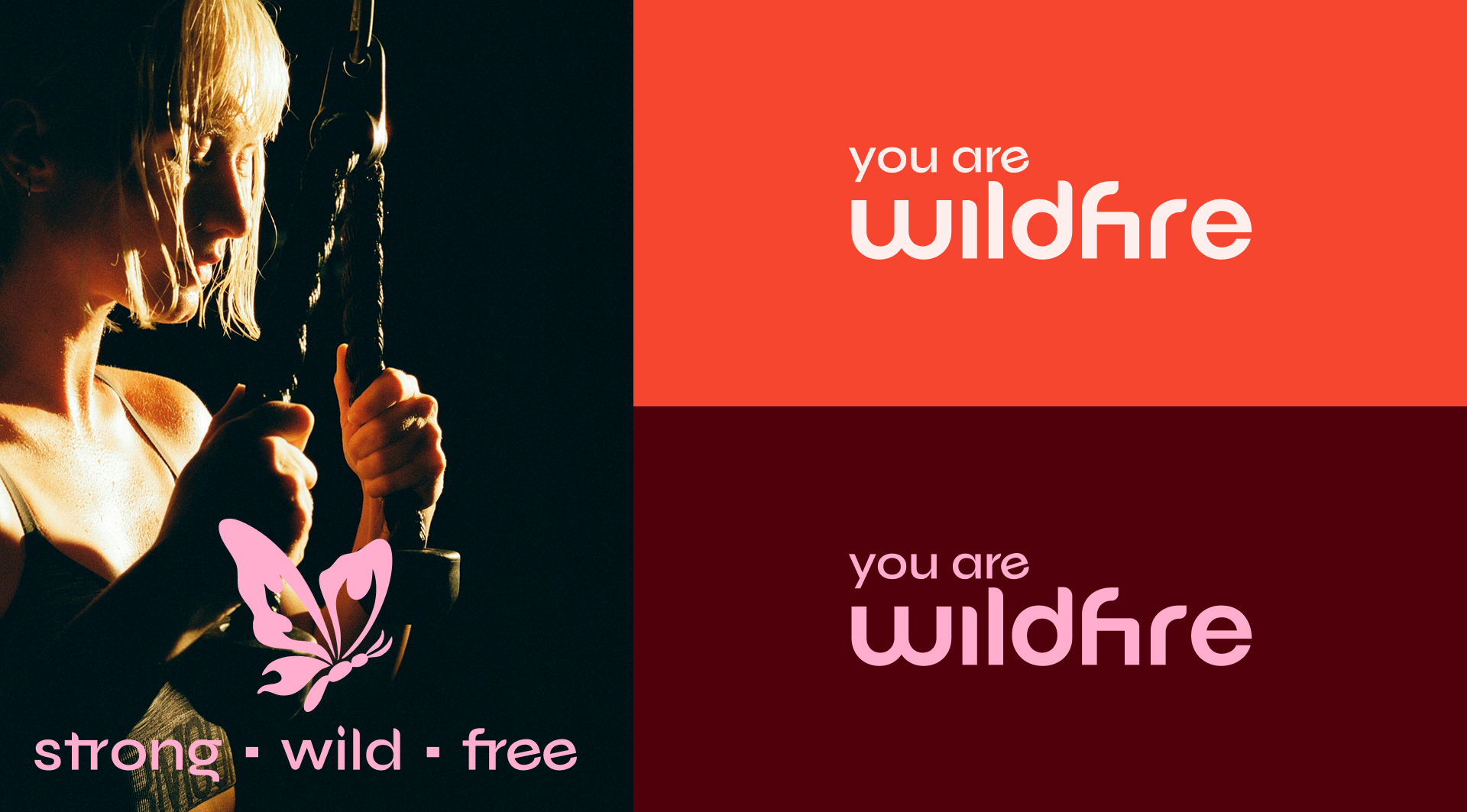
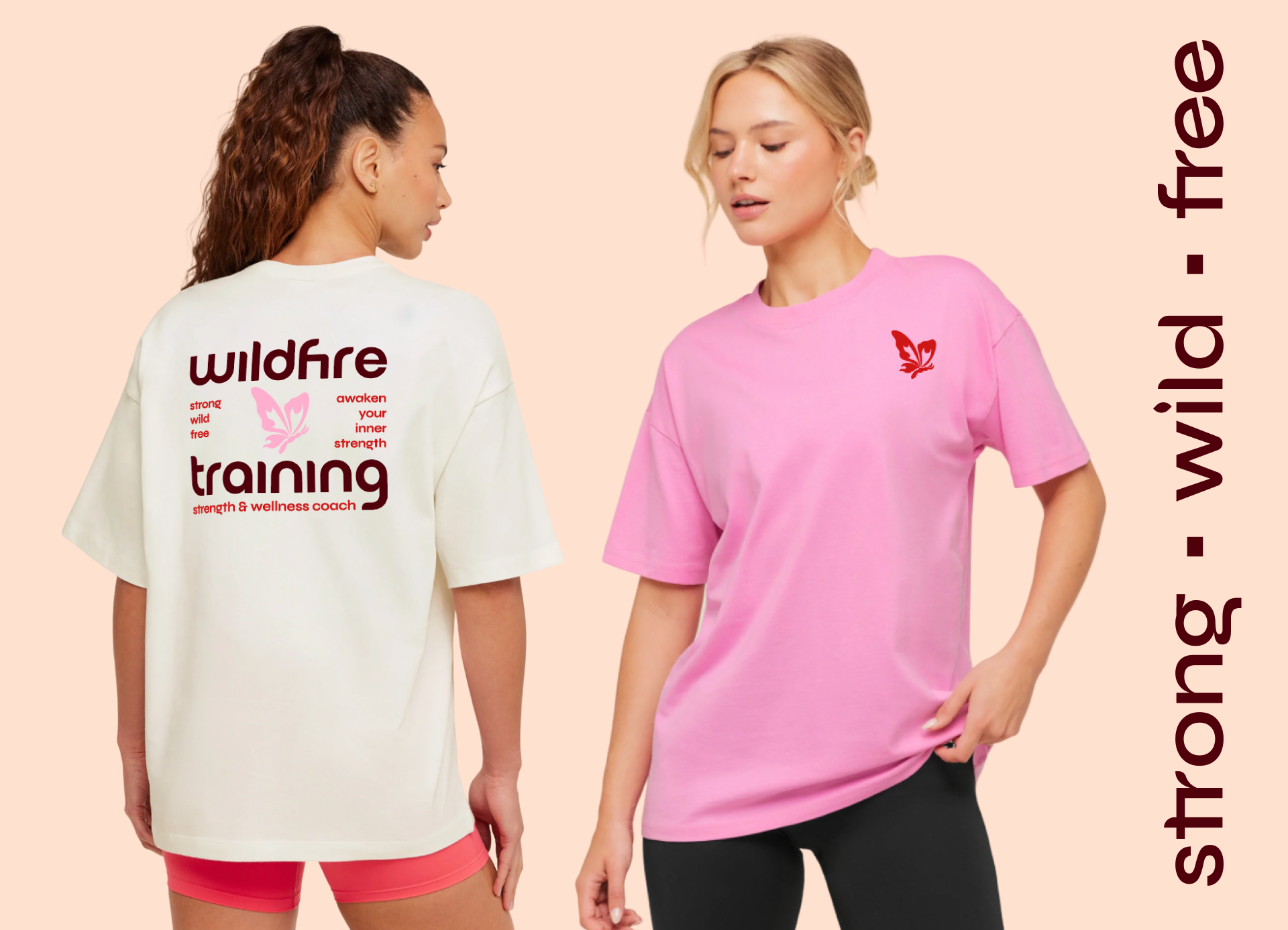
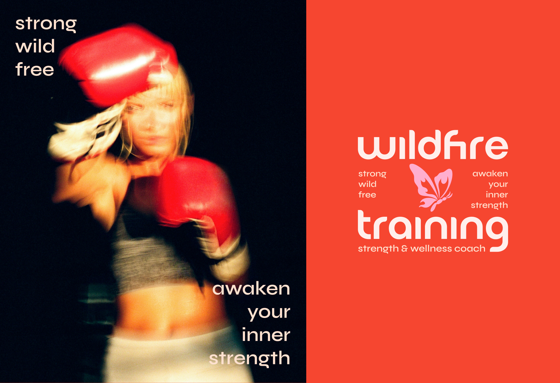
Wildfire Training is a holistic coaching brand built around strength, individuality, and personal growth. The brand identity brings together a bold, wild spirit with a clean, intentional visual system, using strong typography, fiery red tones, natural imagery, and playful monochromatic illustrations. Rather than relying heavily on literal fitness or nature symbolism, the identity keeps these elements supportive and purposeful, allowing the overall brand to feel feminine, confident, and approachable while still carrying an edge. The result is a visual language that feels strong, wild, yet clean and simple, designed to resonate with women looking for a more personal and empowering approach to training.
About:
— Logo, Typography & Color
— Brand Guidelines
— Illustration
Project Scope:




* Continue checking out Studio 2 Skip’s Portfolio *